Navigar
The Professional Institute of the Public Service of Canada (PIPSC) created Navigar to help fulfil our vision to provide outstanding career advancement and support so our members can thrive in the workforce today and in the future.
The vision for Navigar is to provide evidence-based insights for public service professionals navigating the workforce of the future and a skills development platform to help them achieve their goals. As a result, they needed a new, fresh brand identity that aligned with the mission and created confidence and innovation in this new endeavour for government workers.
MY ROLESArt Director
Senior Designer
MY CONTRIBUTIONS Conduct visual workshops
Present to stakeholders
Concepting
Brand strategy
Styleguide
YEAR 2022
Design Process
We held a creative workshop with the PIPSC stakeholders to uncover their vision for the brand’s visual goals and how they could be conveyed to the union members. The Navigar projects aim to support Canadian workers who wish to upskill, re-skill and/or transition to new jobs or industries. They are engaging employers in developing and delivering demand-driven insights and training solutions to address skill gaps more effectively and optimizing skill development systems by building the capacity of service providers to better collaborate with other organizations that could expand or improve their services.
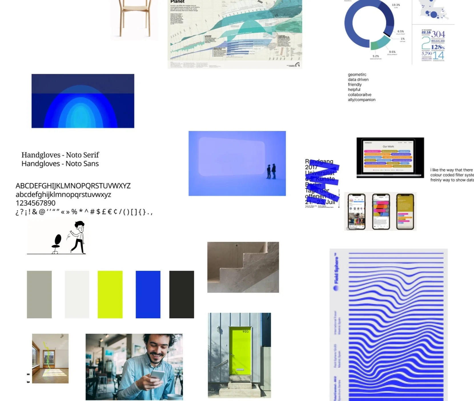
In the creative workshop, the team went on mood boarding to get the right feel for the brand and colour/texture direction. I set off the internal activity to take a Figma board and, throughout two mornings, import images and ideas that we think might relate to the overall Navigar brand. There are no wrong answers or ideas.
From there, we would group and categorize the inspiration and see what patterns and collections might emerge. Our partnership involved regular check-ins and focused work sessions. Guided by research, personas, and stakeholder input, a concept took shape. The goal was to bridge the generational gap between boomers and millennials while upholding the Institute’s professionalism.
Mood boards to get ideas/tones/colour palettes 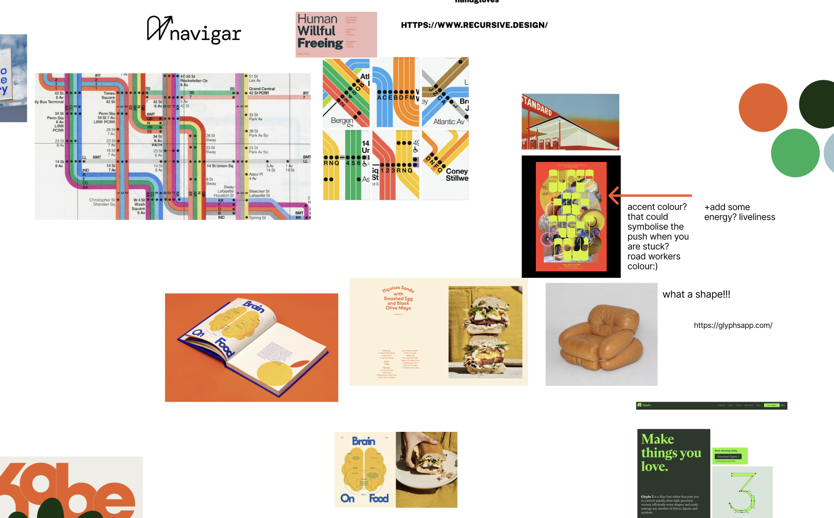
Logo Matrix
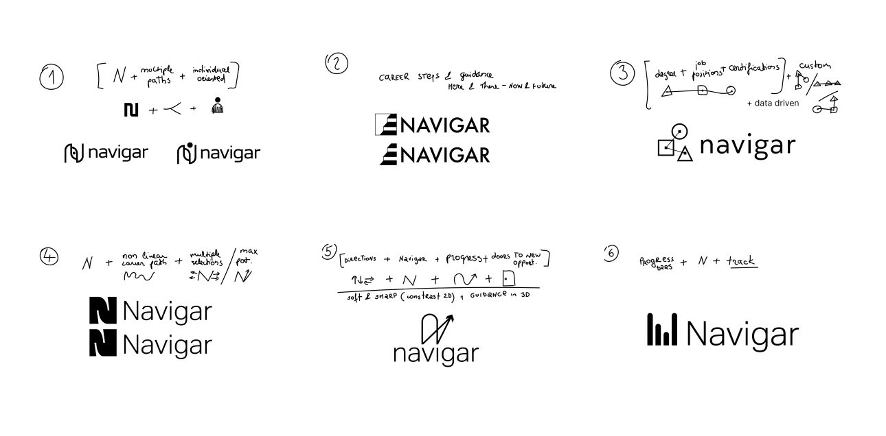
Throughout the revision process, the team and I narrowed down the choices to present to the team. While each represented a different facet of the new brand, the feel and tone differed significantly.
To illustrate this idea, we create a logo matrix.
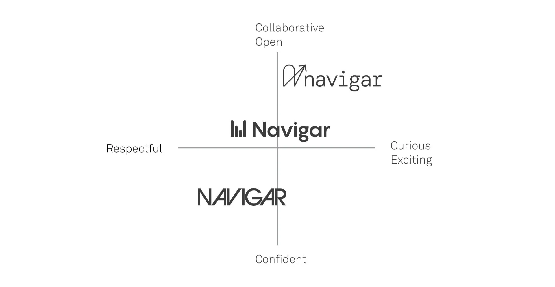
Logo matrix showing how each idea represented a different toneMonitoring your path
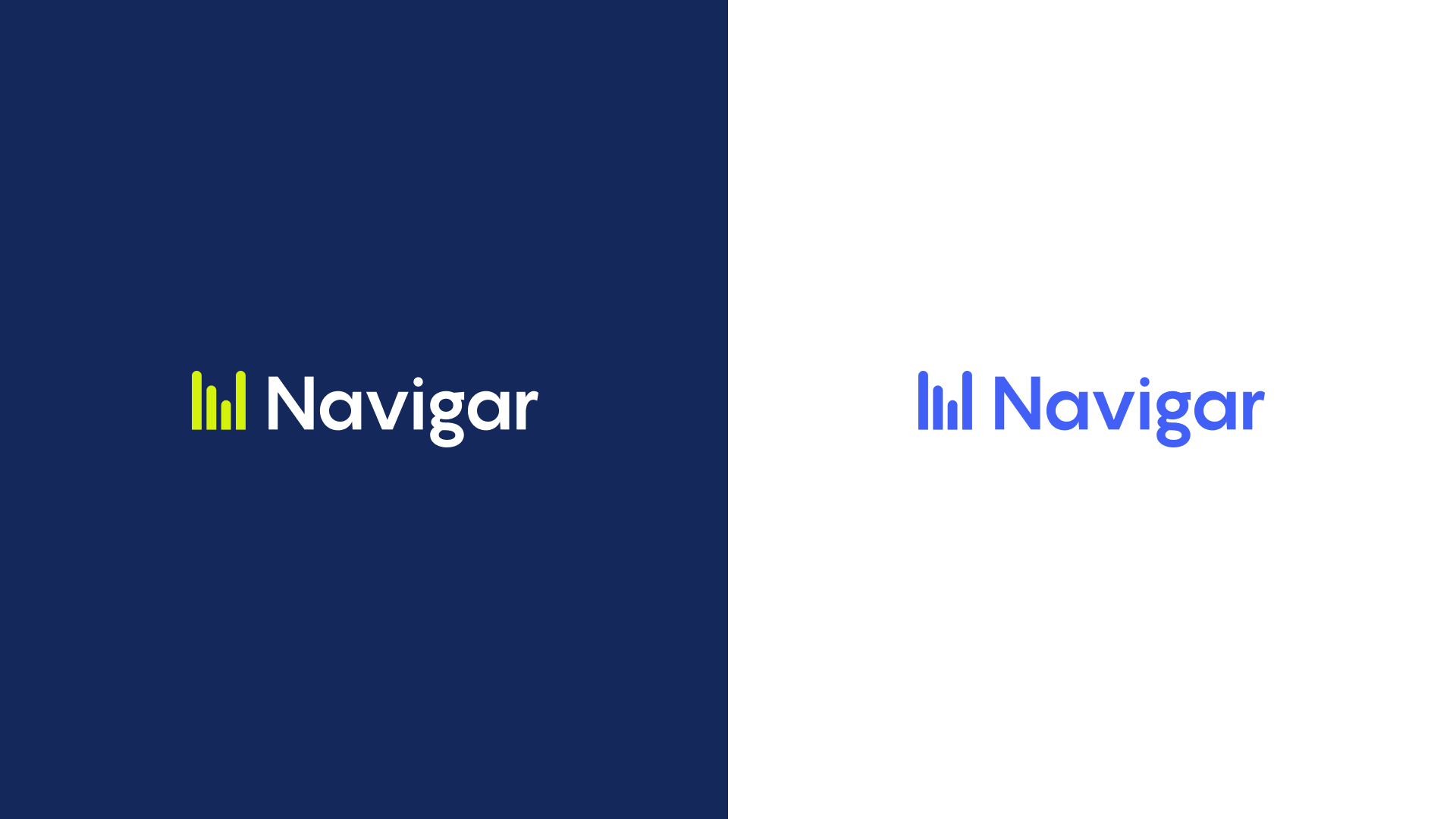
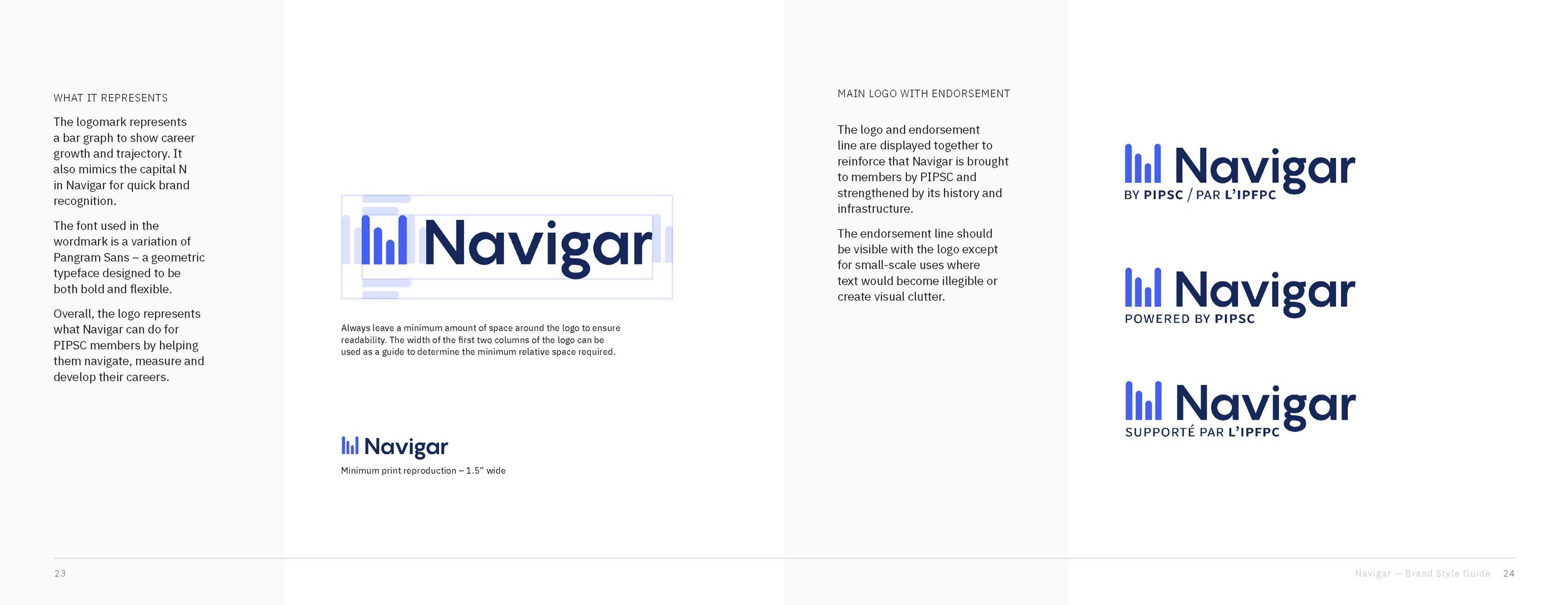
Looking at the three choices above, the final selection was the central logo with the bar graph logo mark with the shape of an “N”. This idea resonated with the team because it symbolized Navigar's goal of providing evidence-based insights for public service professionals to empower them to achieve their goals.
This concept stresses the idea that members’ data is used to obtain a trackable career path, which considers their current skill set and needs and provides personalized insights and an opportunity to see the progress in the path. This design uses an open, airy layout and rounded typography to embody the optimistic and collaborative community feel.
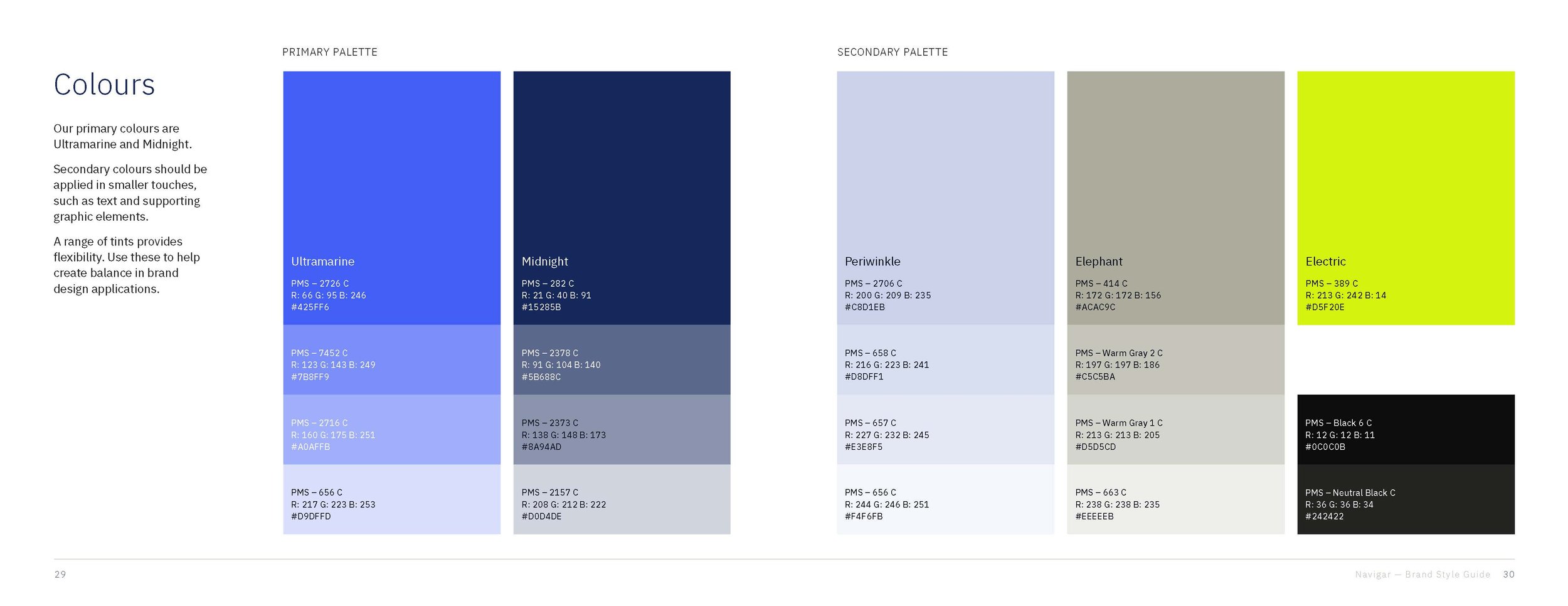
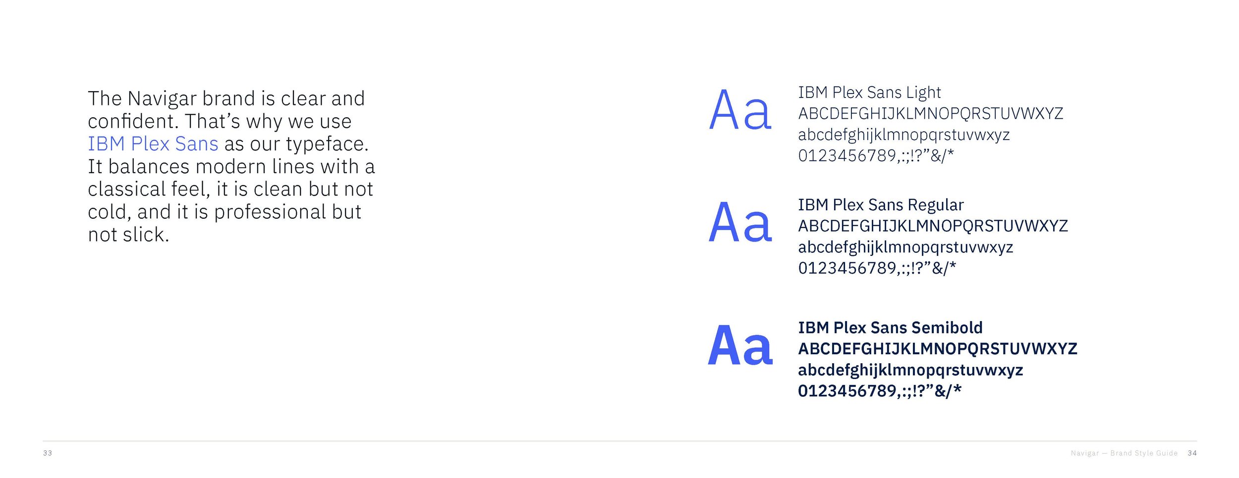
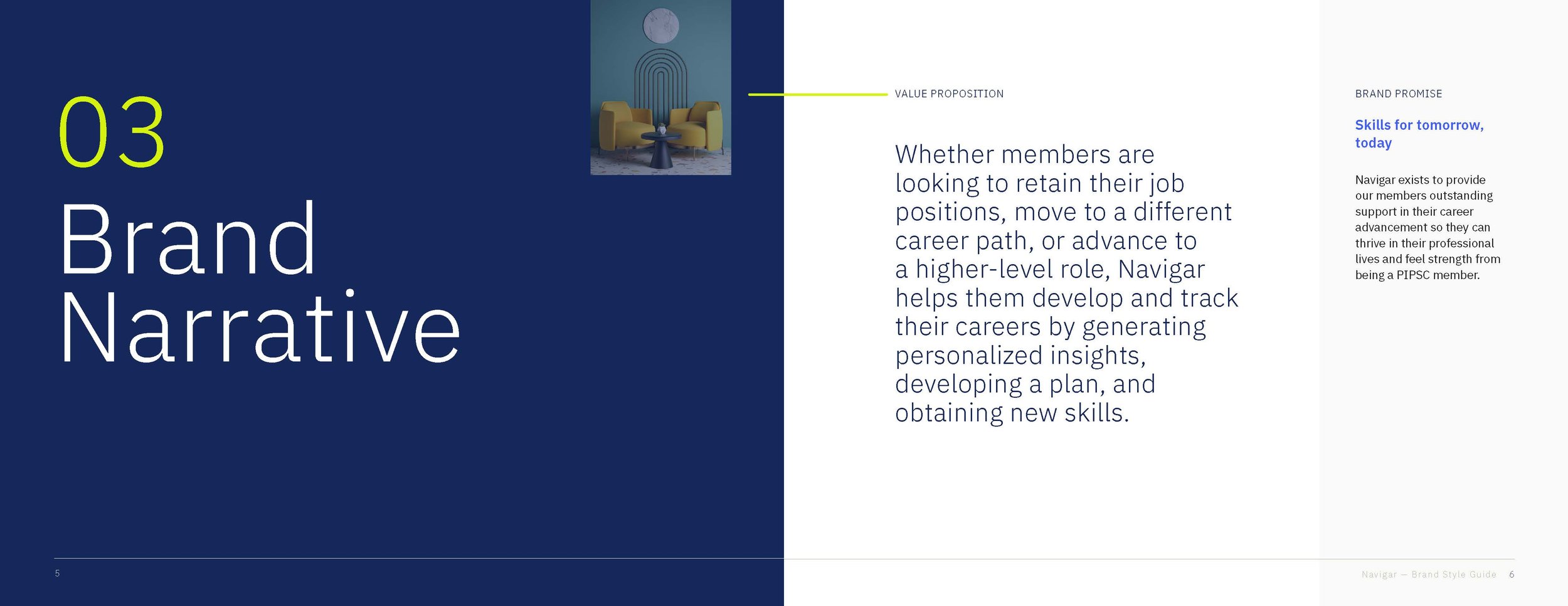
Brand Guidelines