
Insurance Institute of Canada
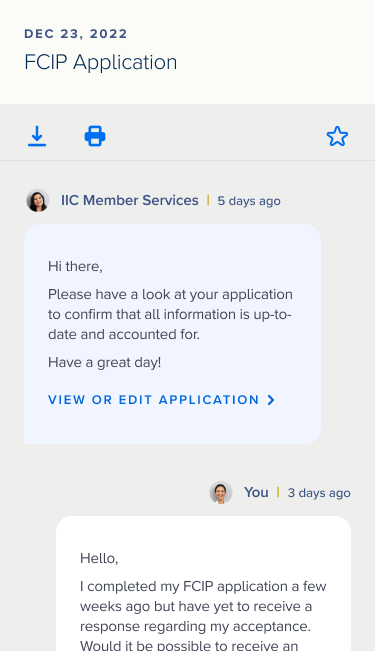
The Institute needed support in revamping its out-of-date website for its community. Some students fulfilled job obligations from their employers to maintain licensing requirements only to withdraw from the community once credits were received. Their customer support team was constantly overwhelmed by user requests for assistance because users could not find information on the website.
The Institute required insights into their user’s needs, wants, and frustrations with an updated visual look of their site. How might we increase interest in the Institute from disengaged students and graduates? How might we empower the community to take control of their career with autonomy? How might we inform and advise the Institute’s stakeholders of their website redesign goals as they continue to work on their roadmap into the future?
MY ROLESUX/UI designer
MY CONTRIBUTIONS Conduct visual workshops
Wireframes brainstorm
Present to stakeholders
UI design
Design iterations based on feedback
Visual design + page layout of the web strategy guide
YEAR 2022

Design Process
We held a creative workshop with the Institute’s stakeholders. The purpose was to uncover what they had envisioned for the visual goals of the new website and to understand where the current site fell short.
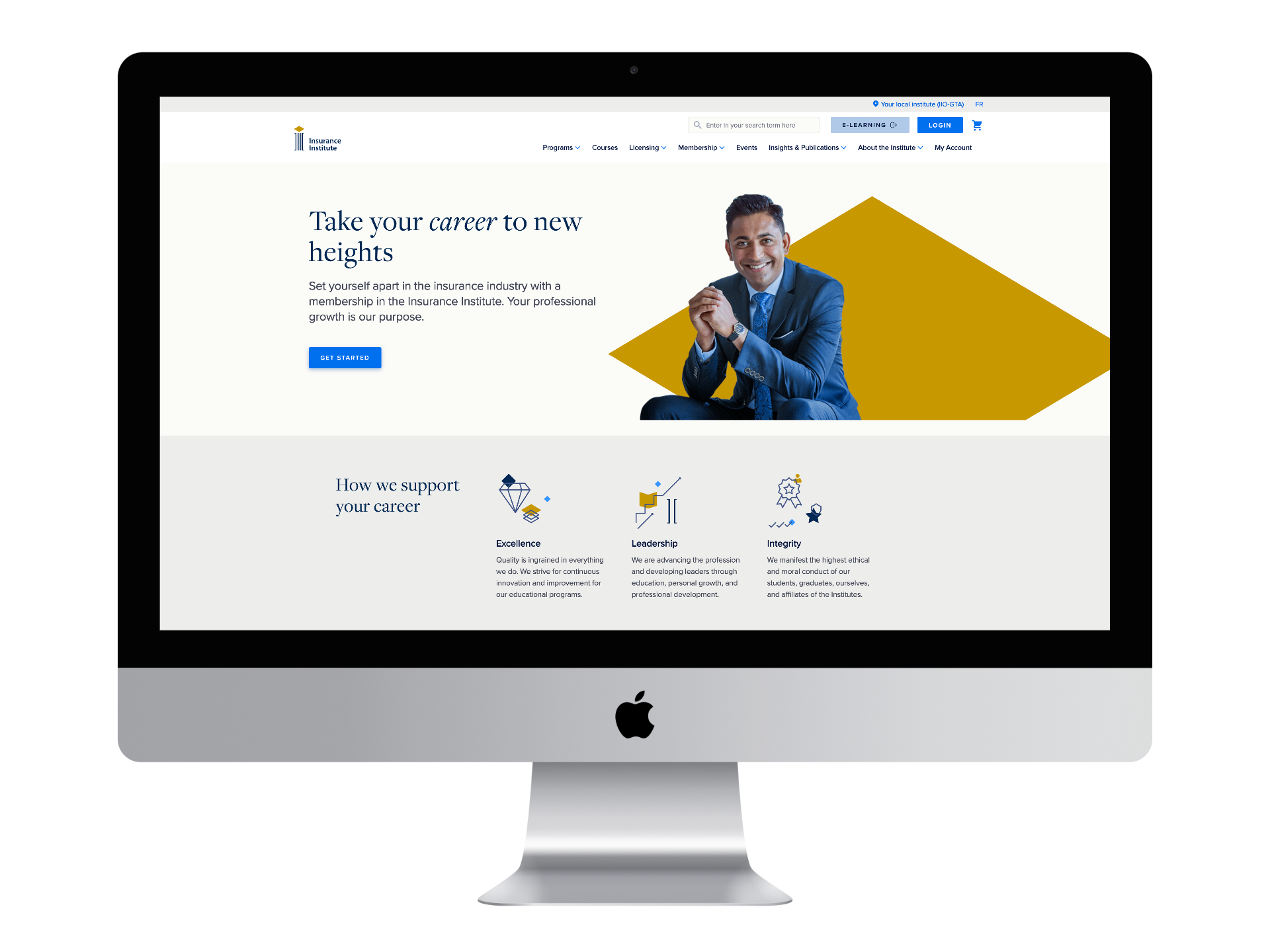
Collaborating with the senior experience designer, we crafted concepts by gathering insights from peers and competitors. Our partnership involved regular check-ins and focused work sessions. Guided by research, personas, and stakeholder input, a concept took shape. The goal was to bridge the generational gap between boomers and millennials while upholding the Institute’s professionalism.
Creating two meticulous mock-ups for each concept, we brought ideas to life with precision. When presented to stakeholders, the third design direction stood out for its seamless blend of tradition and modernity, earning unanimous approval to push the Institute’s vision forward.
Iterative high-fidelity mock-up design: navigating challenges + evolving insights
Throughout the design process, we kept refining high-fidelity mock-ups based on feedback. Font choices had to be adjusted to align better with the brand's vision. Mobile and desktop screens were sequentially developed, with outdated wireframes revealing the need for interaction updates. Stakeholder reviews triggered ongoing design adaptations, necessitating close coordination with the principal experience architect.


Figma file cleanup + design system integration
Following the final sign-off, the senior designer and I readied the Figma file for a streamlined development handoff by tidying it up. We leveraged components from a linked design system we created in a separate Figma document, enhancing organization. The design system encompassed vital elements such as system logic, visual style, photography, patterns, fonts, and colours, ensuring comprehensive coverage for the development process.
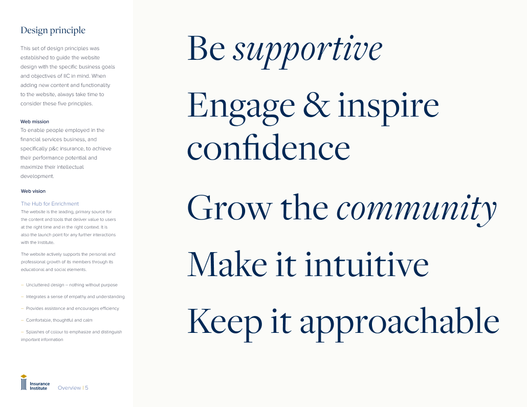
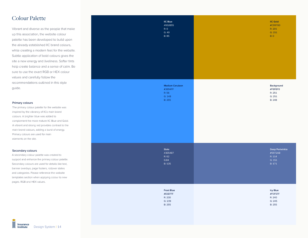
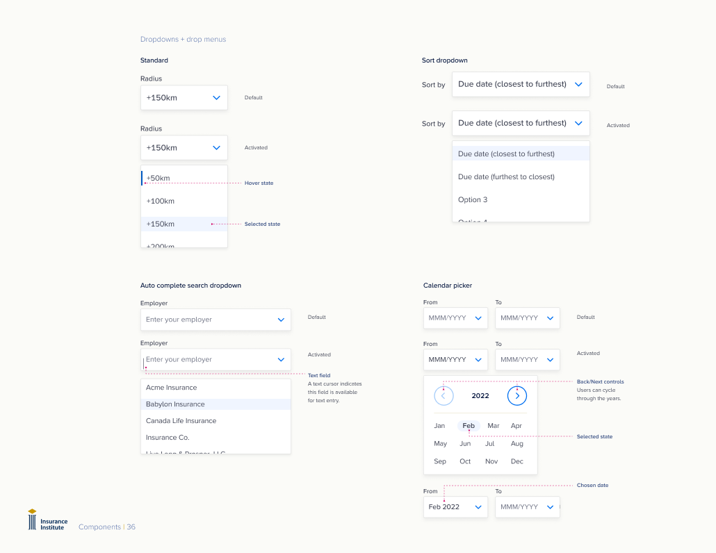
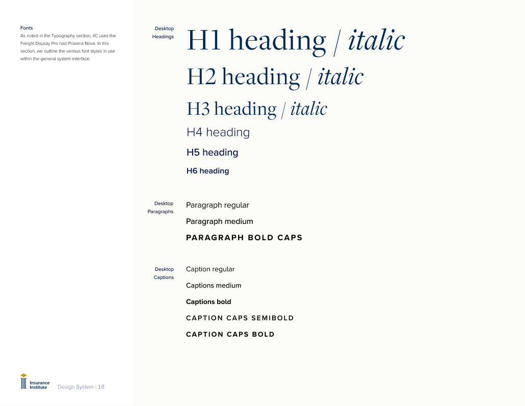
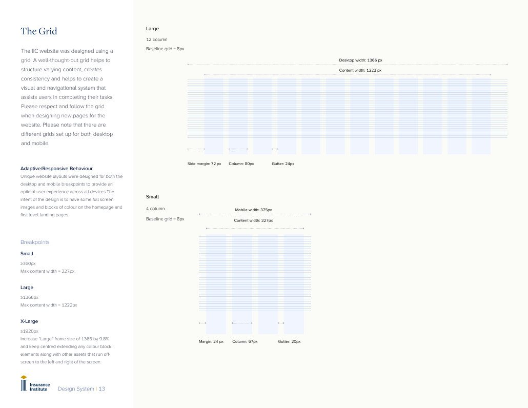

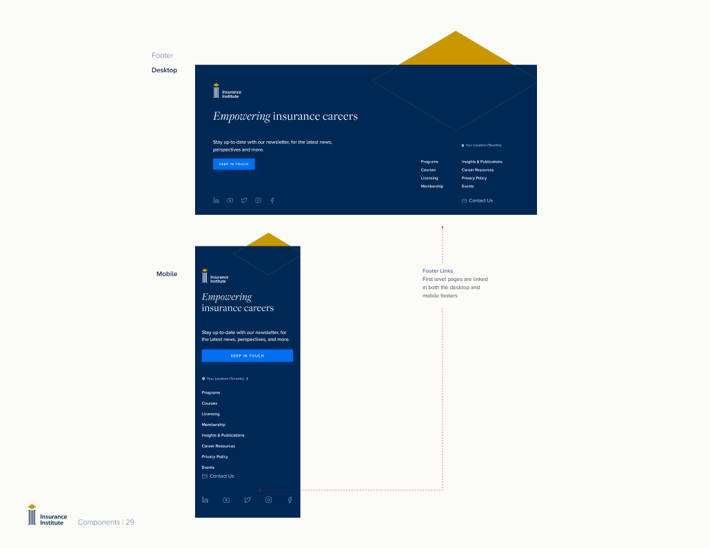
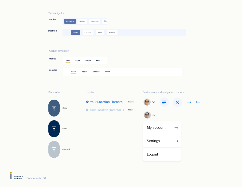
Documented components: We created a robust set of guidlines