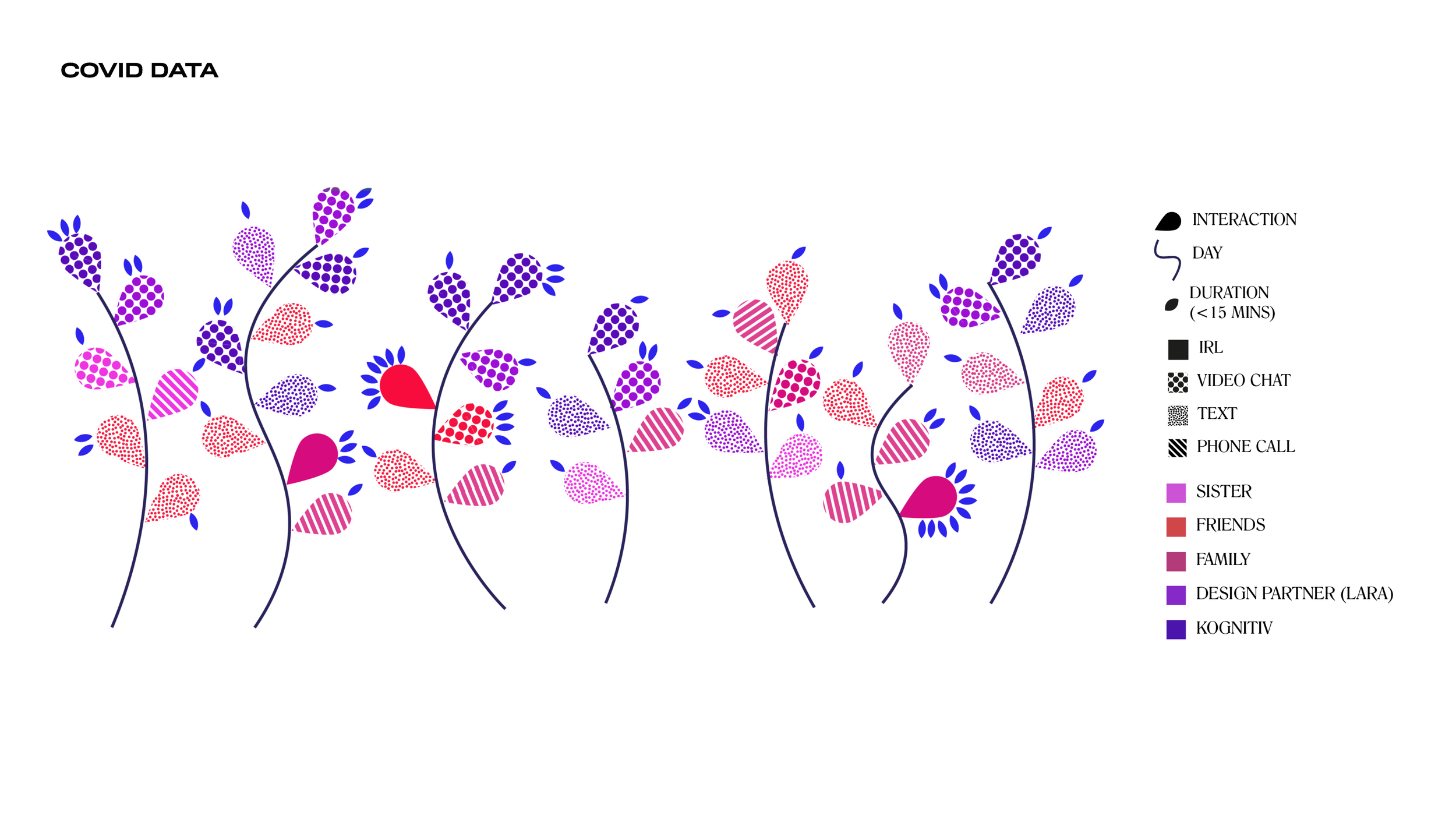
Data Visualization
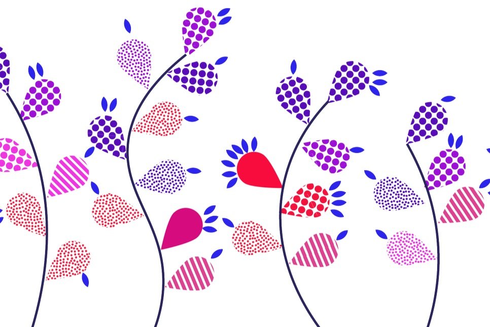
I am very inspired by Giorgia Lupi and the nature of humanist data. In the early days of the pandemic, May 2020, when the world shut down, I felt pretty isolated. I decided to track my modes of communication for seven days. Each stem is a day of the week, and each petal symbolizes a form of communication. The types are colour and pattern coded, as seen in the legend.
It was interesting to see who and how I was talking to the most and when. When I felt untethered, it was reassuring to know that I was still connecting to people in my life.
Humanist Data
Lupi explains how “graphic design is often applied to data simply as a cosmetic retouch of important and complicated issues in an attempt to make them look simpler than they are. What made cheap marketing infographics so popular is probably their biggest contradiction: the false claim that a couple of pictograms and a few big numbers have the innate power to simplify complexity.”
But really, this project helped me think about not making something complex into something simple but instead taking something that I never used to think about. Because of the days of lockdown and the early pandemic, connection and connectivity were all I could think about. And therefore, I could distil and look at my patterns and think about who and how I spend time with.